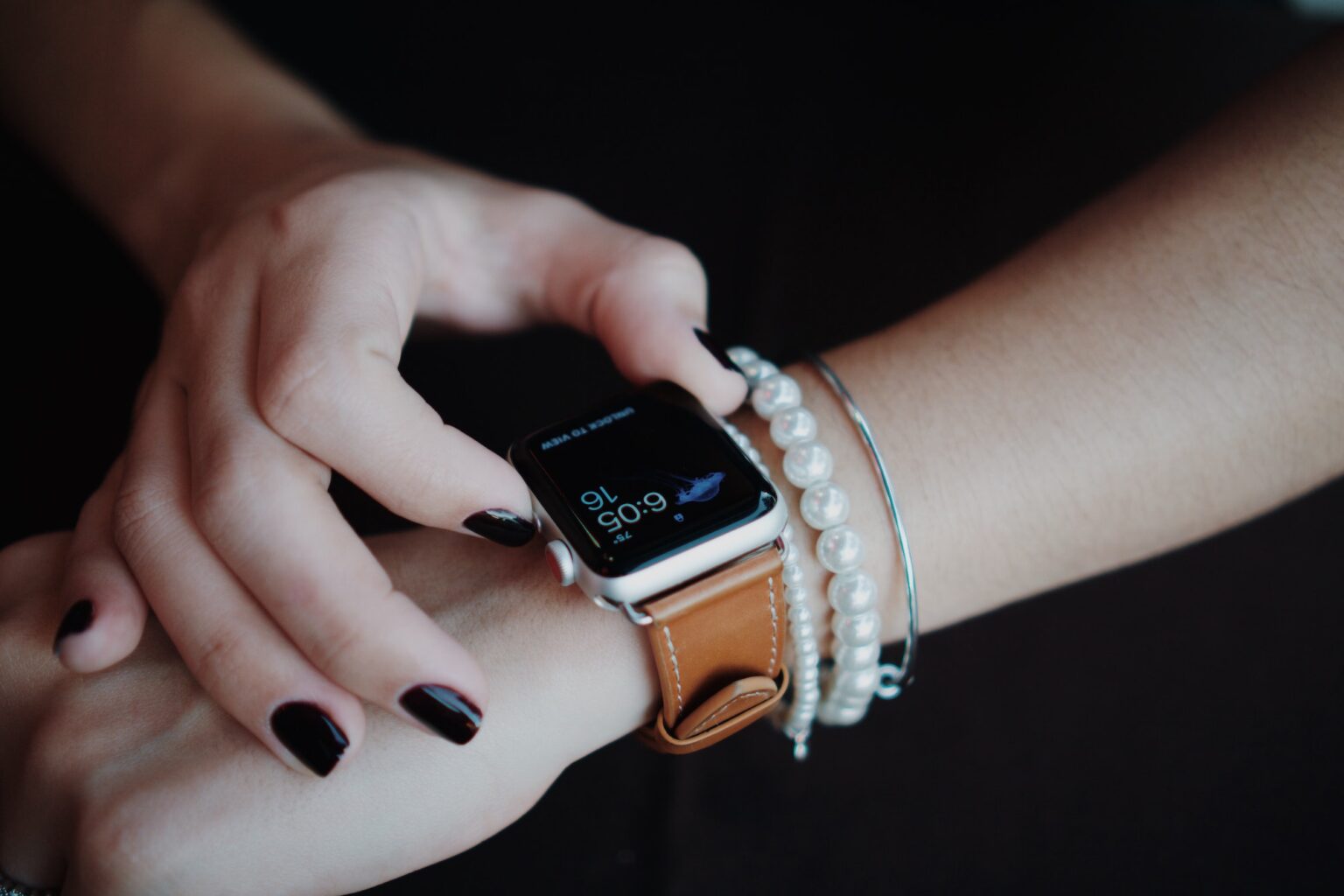
Looking at the specs, this watch has a 1.32 inch high resolution display a 200 milliamp battery, which gives you 7 to 10 days of battery life. A three ATM waterproof rating heart rate and blood oxygen sensors and weighs 56 grams. Looking inside the Box, you get the manual the watch itself and the charging cable, which unfortunately, is a proprietary magnetic connection. Looking at the watch itself, this is definitely a nice, simple and modern design. The watch is all black with a silicone strap, the watch body is metal, and then you just have two buttons here at the side to control the watch. The band is easily removable with the little levers you have back here. So if you want to switch out or have different bands, this does make it really easy to do that. So far, Ive been using this watch for a little over a month. Now and surprisingly, especially when you consider the price, this is a pretty solid and capable watch. I tried watches in the past that are either really laggy or the interface is just garbage, but so far I have no complaints with this watch. I also have a Samsung Galaxy watch and, despite this one missing a few features, it feels just as good and costs more than half the price. So to turn on the watch, you can either click a button at the side or just lift the wrist up and itll automatically turn on the screen.
This is the watch face. I changed it to the default. One looked a bit generic, but fortunately they do offer hundreds of different watch spaces in the app there was a few others. I really liked as well so Ill, probably just switch it up every now and then so to navigate. You just swipe the screen and, as you can see very Snappy and responsive and the screen also looks great as well, so to start tracking an exercise you can either navigate to the apps and click it manually or much easier. Just click the bottom button here and that takes you directly to the workouts list from there you can select your workout and itll start tracking. Then, when you want to go back, you just click the top button, and that takes you back to the home screen. Looking at the rest of the apps, you have status, training, heart rate, monitor blood, oxygen, respiration rate, breathing training, pressure, music controller, so you can control all your music from your phone. This is supposed to show your music on that Center Circle. I dont know if its not compatible with my phone or what, but I havent been able to see the track list there. So for now, mine just shows that little circle, but I am able to still control my music and pause it no problem at all. Then you have a sleep, tracker, weather app and then you can also check your messages.
Notifications, you have in your phone, you have your female Health app lets. Go to more. You have a stopwatch. Timer find me flashlight a few different settings all right. So, instead of going to a notifications app, you can also just swipe up on the home screen and itll. Show you all your notifications there as well. Then, if you swipe up on the home screen, youll see the quick settings tab that has a few different settings, but my favorite one is this little star icon here and with that you can change the theme of how you want your apps to show. So right now I have it on theme two, which is the list view that I have here, but they also have theme, one which is very similar to Apple watch, with all the icons kind of scattered around. Then you have theme three, which is very similar to a Samsung watch with all the icons circling the watch. You can either scrolling like this using the icons or you can just scroll down in the center and scroll up and down on the list as well. So its cool, you have the option to customize it and get it to look the way you want, but personally I think the regular list, one like this is the easiest and most practical way to use the watch. There are two features I wish this watch had. One you cannot reply to text or make calls from the watch so hopefully in the future.
They make something like an S2 Pro and add those features, because if they did Im sure that that watch would sell very well. Second, there is no way to reorganize or customize the home screen tabs. I love personalizing things and putting only the items I want and use often on the home screen, but with this one is pretty much a you get what you get kind of situation. Maybe there is a way to customize them, but I couldnt figure it out or see it mentioned in the manual. So I dont think there is, but this should be something they can easily fix with the software update, so hopefully thats something they eventually implement all right. Well, those two things aside: this is definitely a great watch that not only works well, but its very well priced for what you get. So if you happen to be in the market for a good and affordable smart watch with built in Health tracking features, the tranya S2 is definitely one. I would highly recommend all right well that about wraps up this video as usual.


